Technical & Auditing
New in V3Your whole SEO position on one screen
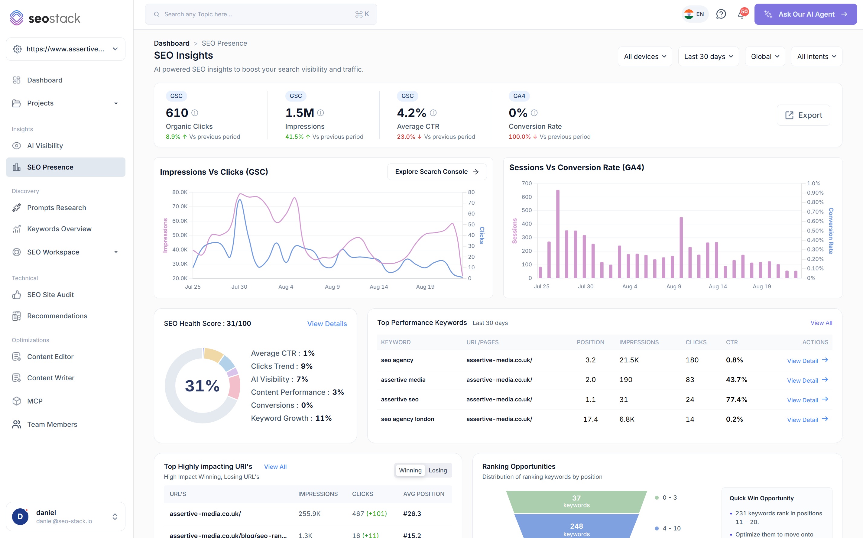
A top level dashboard that puts your Search Console and GA4 data side by side: clicks, impressions, CTR and conversion rate, impressions against clicks over time, sessions against conversion rate, an SEO health score, your top performing keywords, your winning and losing URLs, where your keywords sit by position and the AI opportunities behind all of it.
- 100% data privacy
- 99.99% uptime
- Nothing to configure
- Export anytime, no limits
Trusted by leading companies
The problem
Answering how are we doing normally means opening Search Console, GA4, a rank tracker and a spreadsheet, then reconciling three numbers that never quite agree with each other.
The tool
A top level dashboard, built from your own connected data
SEO Presence is the screen you open first. It combines your Google Search Console and GA4 data into one view of how the site is performing, then breaks that down into the keywords, the URLs and the opportunities behind it, so instead of opening four tools before a reporting meeting you open one.
Two data sources, one screen
Search Console tells you what Google is doing with your pages and GA4 tells you what people do once they arrive, and because both are connected here you can answer questions that neither one answers on its own.
A read on the whole position, not one metric
Clicks, impressions, CTR, conversion rate, keyword growth and AI visibility all sit together, which matters because a site can be growing impressions while losing clicks and you would never notice looking at either number by itself.
Charts that end in something to do
Every panel on the dashboard ends in an action, whether that is a list of striking-distance keywords, the URLs losing clicks or an AI opportunity with the suggestions written out, so you leave with work rather than with an impression.
Impressions vs clicks
- 610
- Organic clicks
- 1.5M
- Impressions
- 4.2%
- Average CTR
- 0.31%
- Conversion rate
8.9%vs previous
41.5%vs previous
23.0%vs previous
6.4%vs previous
- Impressions, left axis
- Clicks, right axis
Illustrative. Switch the range to see the same two metrics over a year, which is the view that keeps working once Google's own window has moved on.
The headline numbers
Four figures, each labelled with where it came from
Every metric on the dashboard carries a GSC or GA4 badge, so there is never any confusion about which tool a number belongs to, and every one of them is shown against the previous period rather than as a figure on its own.

Organic clicks
How many people actually arrived from Google in the period, with the change against the previous one. The number everything else on the dashboard is ultimately trying to explain.
Impressions
How often you were served in results at all. Rising impressions with flat clicks is one of the most common patterns there is, and it means Google is finding you relevant but nobody is choosing you.
Average CTR
The percentage of impressions that turned into a click. Falling CTR against rising impressions usually means you are being served for broader terms rather than that your titles have got worse.
Conversion rate
What organic traffic does once it lands, pulled from your connected GA4 property, so the dashboard is not measuring visibility in isolation from whether the visibility is worth anything.
Search and behaviour, together
Impressions against clicks, and sessions against conversion rate
These two charts are the reason the dashboard exists. One shows you what Google is doing with your pages and the other shows you what happens after somebody arrives, and having them next to each other is what turns a number going down into an explanation.
Impressions vs clicks (GSC)
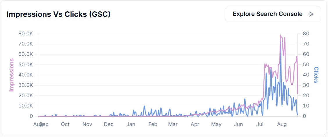
Both series on a dual axis, so you can see whether they are moving together or apart. When the impression line climbs and the click line does not follow, you have a click-through problem rather than a visibility problem, and those need completely different work. There is a route straight into the Search Console tools from the chart when you want to take it apart query by query.
Sessions vs conversion rate (GA4)
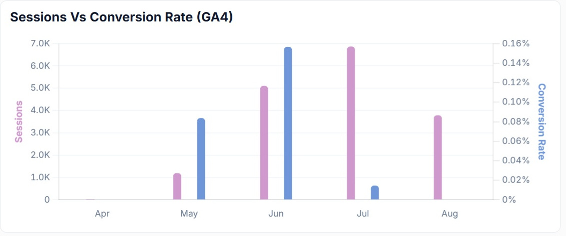
Organic sessions plotted against conversion rate from your GA4 property. Naturally the two often move in opposite directions, because a burst of broad traffic converts worse than a smaller amount of qualified traffic, and seeing that on the same dashboard as your impressions is what stops a good month being reported as a bad one.
SEO health score
One score, and the six things underneath it
The health score is a quick read on the whole position, but a score you cannot break down is not much use to anybody, so the six factors that make it up are shown individually with the points each one is contributing.
SEO health score
45/100 from six contributing factors
Clicks trend
17 of 45 points
What it measures
Whether your organic clicks are growing or falling against the previous period, using your own warehoused Search Console data.
How you move it
Find the pages losing clicks before the total starts falling, because a site level number stays flat for a long time while individual pages underneath it are already decaying.
Illustrative scoring. Select a factor to see what it is measuring, the total is summed from the six rather than set separately.
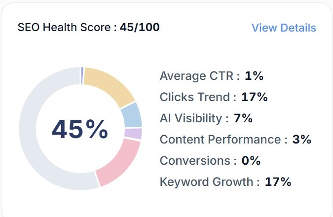
What makes it worth looking at is that the factors are not all the same kind of thing. Clicks trend and keyword growth are performance, AI visibility is a channel that barely existed a couple of years ago, and conversions come from GA4, so a low score tells you which part of the operation is dragging rather than just that something is wrong.
The technical health score lives in the site auditKeywords and URLs
What is performing, and what is moving
Underneath the headline charts the dashboard gets specific, because the useful questions are usually which keywords are carrying the site and which pages have started to move, in either direction.
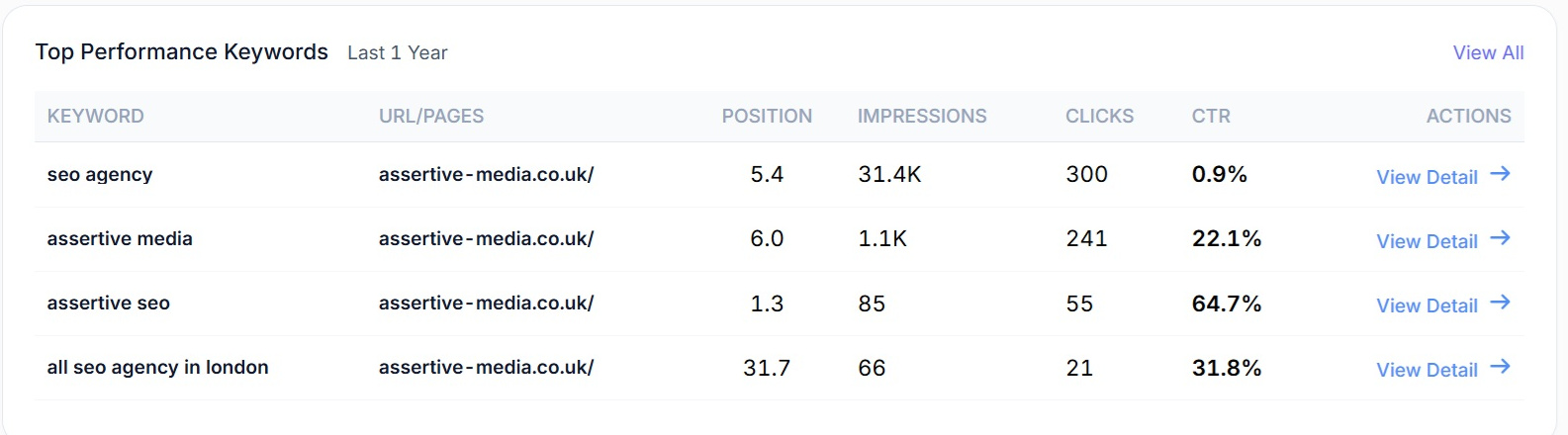
Top performance keywords
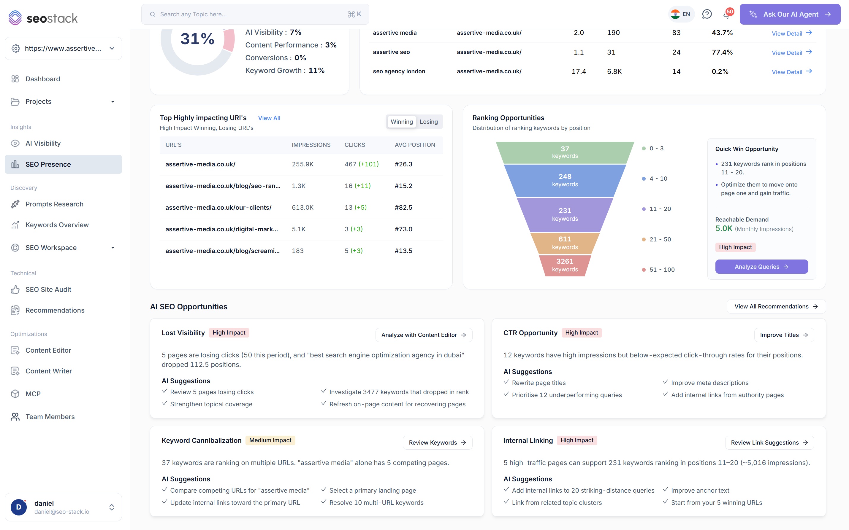
Your best performing queries with the URL they land on, the average position, the impressions, the clicks and the CTR, so you can see at a glance where a keyword is ranking well and converting the impression into a click, and where it is ranking well and not. Anything on the list opens into its own detail, which is where you go when a term you care about starts to move.
Top highly impacting URLs, winning and losing
The pages moving the needle, with a toggle between winning and losing so you can look at either side of the ledger. Each row shows impressions, clicks with the change in brackets and the average position, which between them tell you whether a page gained clicks because it moved up or because it started being served for more things.
Typically the losing view is the more valuable of the two, because a page losing clicks is far easier to fix while it is still losing them than six months later when the traffic has gone.
More on winners and losers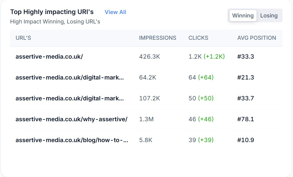
Ranking opportunities
Every keyword you rank for, bucketed by position
Most sites have far more ranking keywords than anybody realises, and the ones worth working on are almost never the ones already on page one, so the distribution is broken into bands and the band just off page one is called out with the demand attached to it.
Ranking opportunities
4,993 ranking keywords by position
Positions 11 to 20
Striking distance
The band everybody wants, because these keywords are one or two positions away from page one and Google has already decided the page is relevant. Internal links from your winning pages and a content refresh will move a good proportion of them.
- Keywords
- 337
- Reachable demand
- 8.4K monthly impressions
This is the quick win panel in the product, and it is doing the arithmetic you would otherwise do by hand: how much monthly impression volume is sitting just off page one, and therefore whether the work is worth booking.
Illustrative distribution. Select a band to see what it is worth doing about.
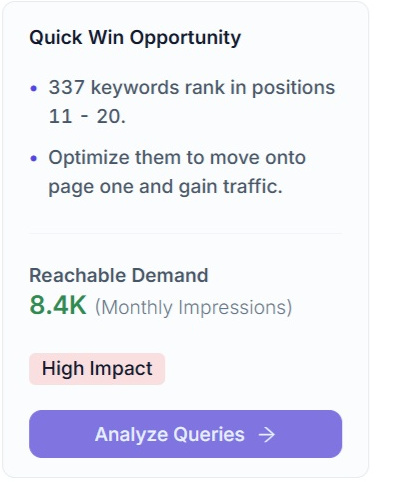
Reachable demand, worked out for you
The quick win panel takes the keywords sitting in positions 11 to 20 and adds up the monthly impressions behind them, which turns a vague sense that there is something there into a number you can weigh against the effort. Naturally it varies a lot by site, some domains have thousands of keywords in that band worth almost nothing and others have forty worth a great deal, which is exactly why it is worth calculating rather than assuming.
AI SEO opportunities
The dashboard tells you what it found, then what to do
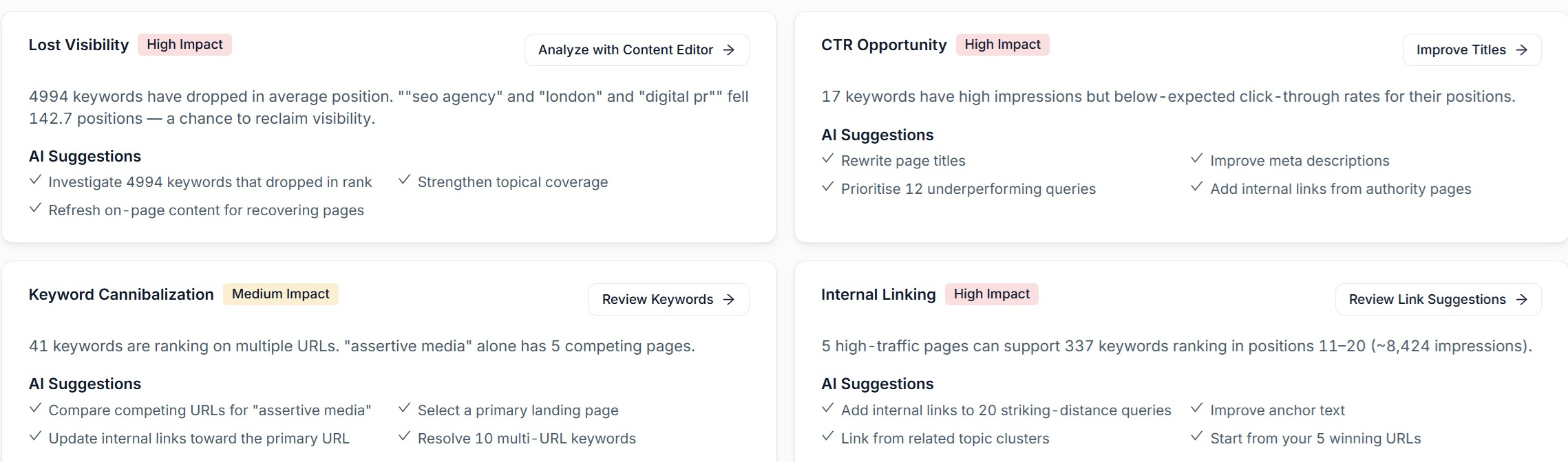
At the bottom of the dashboard the AI reads everything above it and writes up four opportunities, each with an impact rating, the specific numbers behind it and a set of suggestions, so the screen ends with work rather than with charts.
Lost visibility
High impactPages losing clicks and keywords that have dropped in average position, with the biggest fallers named.
AI suggestions
- Review the pages losing clicks
- Investigate the keywords that dropped in rank
- Strengthen topical coverage
- Refresh on-page content for recovering pages
CTR opportunity
High impactKeywords with high impressions and a click-through rate below what their position should be earning.
AI suggestions
- Rewrite page titles
- Improve meta descriptions
- Prioritise the underperforming queries
- Add internal links from authority pages
Keyword cannibalisation
Medium impactKeywords ranking on more than one URL, with the number of competing pages against each one.
AI suggestions
- Compare the competing URLs
- Select a primary landing page
- Update internal links toward the primary URL
- Resolve the multi-URL keywords
Internal linking
High impactWhich of your high-traffic pages can support the keywords sitting in positions 11 to 20, and roughly how many impressions that is worth.
AI suggestions
- Add internal links to striking-distance queries
- Improve anchor text
- Link from related topic clusters
- Start from your winning URLs
Segmenting the dashboard
The same screen, narrowed to the question you are asking
Four controls sit above the dashboard and every panel below them responds, so rather than a fixed report you get a view you can point at whatever you are investigating, whether that is one market, one device, one intent or a specific window of time. There is an export on the strip as well, for when the numbers need to live in a deck or a spreadsheet.
All devices
Split desktop, mobile and tablet, because a CTR problem on mobile and a CTR problem on desktop are rarely the same problem.
Date range
Any window you need, and because your Search Console data is warehoused rather than capped at sixteen months, the long comparisons keep working.
Country
Look at the whole picture or one market at a time, which matters a great deal if a single country is carrying or dragging your averages.
Query intent
Filter down to informational, commercial, transactional or navigational queries, so you can judge the parts of the site that are meant to sell separately from the parts meant to inform.
Export
Take the whole view out when it needs to go into a report, with no row limits on the way out.

How SEOs use it
What SEO Presence is actually good for
Open one screen before the meeting
Clicks, impressions, CTR, conversion rate, the health score, the winning and losing pages and the opportunities are all in one place, so the preparation that used to mean four tools and a spreadsheet is one tab.
Diagnose a fall in traffic properly
Impressions against clicks tells you whether you lost visibility or lost the click, and sessions against conversion rate tells you whether the traffic you did get was any good. Those are three completely different conversations.
Find this month's quick wins
The position bands show how many keywords are sitting just off page one and the quick win panel puts an impression figure against them, so the work can be justified before it is started.
Decide what to refresh
The losing URLs and the lost visibility card between them name the pages and the keywords that have dropped, which is a far better brief for a content refresh than picking the oldest posts.
Keep AI visibility in the same conversation
AI visibility is one of the six factors in the health score rather than a separate report, so it gets reviewed alongside everything else instead of being remembered once a quarter.
Ask the AI assistant to go deeper
When a panel raises a question, the AI assistant is reading the same warehoused data underneath the dashboard, so you can ask it why something moved rather than exporting it and working it out yourself.
What you get out of it
The outcome, not the feature list
Open one screen before a client call instead of four
See whether a fall in clicks is a ranking problem or a click-through problem
Leave with a list of opportunities rather than a set of charts
Works well with
More in Technical & Auditing
Connect a property. Watch the data start stacking.
Warehousing begins the moment you connect your Search Console property, there is no Google Cloud project to set up, no BigQuery and no schema to design. You simply connect your property and SEO Stack starts storing every row of your data from that day onwards.
- Credit card required
- Cancel within the trial and you won't be billed
- No contracts