Discovery & Opportunity
See which of your pages are gaining ground and which have stalled
Build a URL group or a filter, then plot the total volume of queries every one of those pages is being served for on a single chart, so you can see the serve weighting of dozens of URLs at once rather than checking them one at a time.
- 100% data privacy
- 99.99% uptime
- Nothing to configure
- Export anytime, no limits
Trusted by leading companies
The problem
Comparing how the last twenty pages you published are performing means twenty separate lookups, which is slow enough that nobody does it, so pages Google never really picked up sit there unnoticed for months.
The tool
Every page in a group, on one chart
Query Trajectory works like Query Counting, except instead of looking at one URL you are looking at all of them together, which is how you spot patterns across a section rather than facts about a page.
URL contains /digital-marketing/
Served queries, by month
- Growing
- 2
- Stagnant
- 1
- Declining
- 2
Illustrative. Select a URL to dim its line, the same way you isolate a signal in the tool.
You choose which pages appear
Set up your own URL groups, or filter by URL contains, and every page that matches gets its own line. A section, a template, a campaign or the last twenty things you published, whichever question you are trying to answer.
Serve weighting for all of them at once
Each line is the total volume of queries that URL is being served for over time, which is a much better read on whether Google is giving a page weight than a clicks chart is.
The three shapes you are looking for
A page climbing, a page that peaked and turned, and a page Google never really picked up. Seeing them side by side is what makes the comparison worth doing rather than checking pages one at a time.
Inside the tool
Plot the group, read the table, then isolate what matters
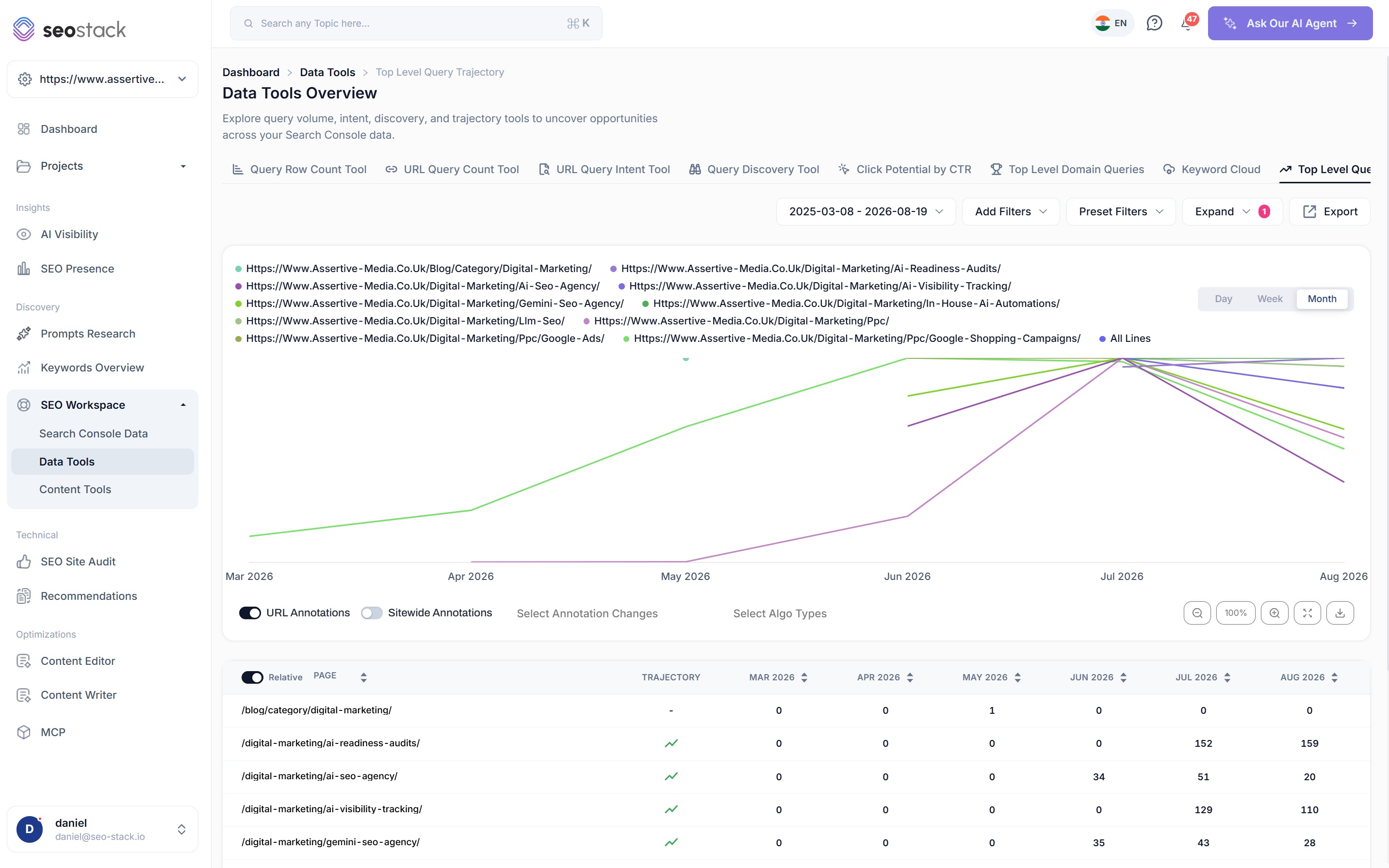
Every matching URL plotted together
- One line per URL, with the full list in the legend so you always know which page is which
- Day, week and month views, and because your data is warehoused the long view keeps reaching back
- URL and sitewide annotations toggled independently
- Google algorithm updates overlaid across the period
- Zoom, expand to full screen and download the chart as an image
A trajectory indicator on every page
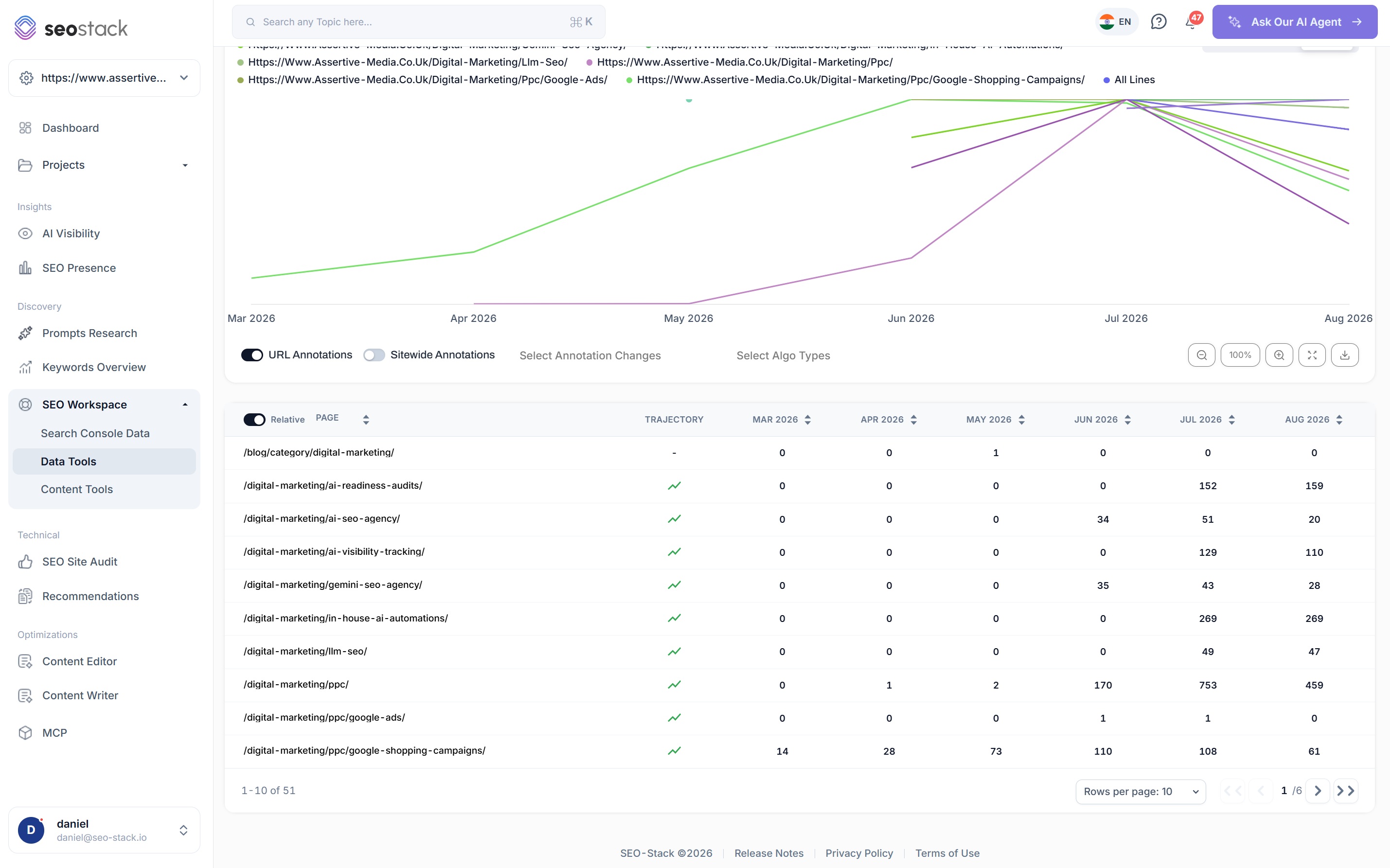
- One row per URL with a trajectory arrow, then the served query count for each period
- Sort by any month to find the pages that moved most in a specific window
- The relative toggle rescales the comparison so a large page does not flatten everything else
- Paginated across the whole group rather than a sample
- Export the table when you need to work on it elsewhere
The zeros are the useful part
A row of zeros running for months on a page you published a year ago is Google telling you it never found a reason to serve that page for anything.
Turn everything off except the pages you care about
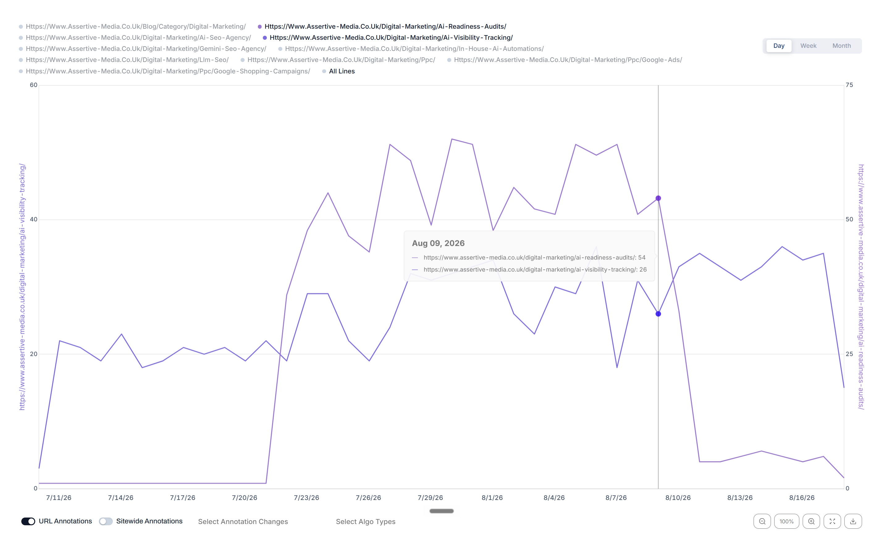
- Deselect URLs in the legend to bring one or two lines forward
- A dual axis means two pages of very different sizes can still be compared properly
- Switch to the day view to investigate exactly when something changed
- Hover any date for the served query count on each active line
What you are looking for
Three shapes, three completely different jobs
The reason to plot a whole group together is that these three shapes are obvious next to each other and almost invisible one page at a time.
Gaining
The served query count is climbing month after month, which means Google is finding more reasons to return the page. This is the shape you want after publishing, and it usually appears well before the clicks do.
Stagnant
The line is flat, often at or near zero. Google has indexed the page and then found very little to serve it for. Usually a relevance or an internal linking problem rather than anything technical.
In decline
The count peaked and has been falling since. Google is narrowing what it considers the page relevant for, which is worth catching early because it tends to keep going.
How you set it up
Choose the pages, then choose the window
Your own URL groups
Build a group once and reuse it, so a section you report on every month is two clicks away rather than something you rebuild each time.
Filter by URL contains
Anything matching a pattern gets pulled in automatically, which is the quickest way to look at a folder, a template or a campaign without listing pages by hand.
Day, week or month
Daily when you are investigating something specific, weekly to see the shape without the noise, monthly for trajectory across a year or more.
Annotations and algorithm updates
Your own changes and Google's updates are both plotted on the same timeline, so when a whole group of pages moves at once you can see whether it was you or Google.
How SEOs use it
What Query Trajectory is actually good for
Judge a content programme properly
Plot everything you published in a quarter together. The pages that took off, the ones that never moved and the ones that peaked early tell you far more about what is working than an average across all of them.
Find pages Google never picked up
A flat line at zero months after publishing is the clearest signal there is that a page is not earning relevance for anything, and it is very hard to notice when you are looking at pages individually.
Compare templates against each other
Run one group for your service pages and another for your guides. If one template consistently gains serve weighting and the other does not, that is a structural finding rather than a content one.
Spot a section wide problem
When every line in a group turns down at the same point, it is almost never a coincidence. Annotations and algorithm updates on the same chart usually tell you which of the two it was.
Prove a section is compounding
Showing a client that every page in a section has grown its served query volume over six months is a stronger argument than a traffic line, because it demonstrates Google is giving the whole section more weight.
Decide where to invest next
The pages already gaining serve weighting are usually the cheapest to push further, because Google has already decided they are relevant. The flat ones need a different conversation entirely.
What you get out of it
The outcome, not the feature list
See which of your recent publishes actually took off
Identify pages Google never really picked up
Compare a whole section of the site in one view rather than page by page
Connect a property. Watch the data start stacking.
Warehousing begins the moment you connect your Search Console property, there is no Google Cloud project to set up, no BigQuery and no schema to design. You simply connect your property and SEO Stack starts storing every row of your data from that day onwards.
- Credit card required
- Cancel within the trial and you won't be billed
- No contracts