Discovery & Opportunity
Work out whether you lost rankings or lost reach
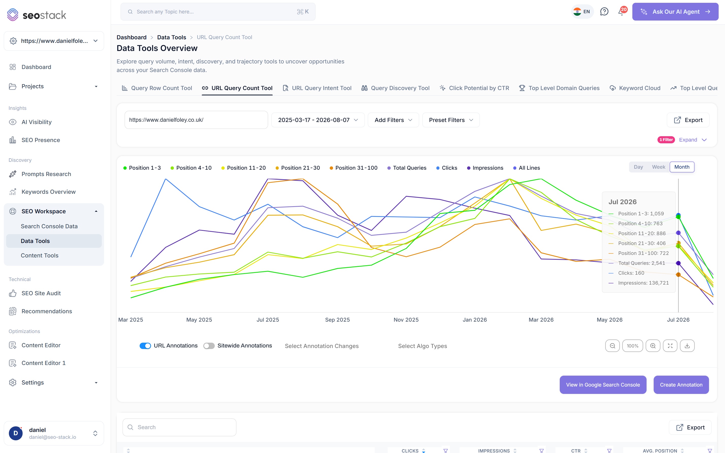
See how many distinct queries a URL, a URL group or your whole domain is being served for over time, broken into position bands, then log annotations for the changes you made and look at exactly what each one did to those counts.
- 100% data privacy
- 99.99% uptime
- Nothing to configure
- Export anytime, no limits
Trusted by leading companies
The problem
When clicks fall, a normal traffic chart cannot tell you whether your positions slipped or whether Google simply stopped serving you for as many queries. Those are completely different problems with completely different fixes, and treating one as the other wastes months.
The idea behind it
Two very different causes look identical on a traffic chart
Query counting is simply a measure of how many distinct queries Google is willing to serve your page for, and where those queries sit. A page might be returned for 400 different searches this month and 250 next month, and that change tells you something a clicks chart never will.
When clicks fall on a page, there are two completely different explanations. Either your positions slipped, so you are still being served for the same queries but sitting lower down, or the number of queries you are served for has dropped, which usually means Google has decided the page is relevant for less than it used to be. The first is a ranking problem, the second is closer to devaluation, and they need entirely different work.
Because query counts are split by position band, you can see which of the two it is straight away. If your total query count is holding steady but the 1 to 3 band has emptied into the 11 to 20 band, you have slipped. If the bands are roughly proportional but the total has fallen off, Google is serving you for less, and no amount of on-page tweaking to chase a position will fix that.
What you can count
From one URL up to the entire domain
A single URL
Paste in any URL and see how many queries it is served for, how those queries are distributed across the position bands, and how that has moved over the period you choose.
A URL group
Look at a sub folder, a template or any group of URLs together, which is usually how you spot that an entire content type has been devalued rather than one page having a bad month.
The full domain
Roll it up to the whole site for the top level view, which is the fastest way to tell whether something site wide has happened or whether the problem is contained.
Day, week or month
Switch the granularity to suit the question. Daily is right for investigating something that just happened, monthly is far better for reading trajectory without the noise.
Position bands
- Position 1-3
- Position 4-10
- Position 11-20
- Position 21-30
- Position 31-100
- Total queries
- Clicks
- Impressions
Every line can be turned on and off individually, so you can put any combination on the chart together. Positions 1 to 3 against clicks tells you whether your best rankings are converting, positions 1 to 3 and 4 to 10 against impressions tells you whether the top of the site is growing or just churning.
Inside the tool
The chart, the combinations and the numbers behind them
Query counts and position bands over time
- Every position band plotted as its own line, with total queries, clicks and impressions available alongside them
- Day, week and month views, with a dual axis so a band and a volume metric can share the chart sensibly
- URL annotations and sitewide annotations toggled on or off independently
- Filter by algorithm update type to see Google's updates against your own changes
- Zoom, expand to full screen and download the chart as an image
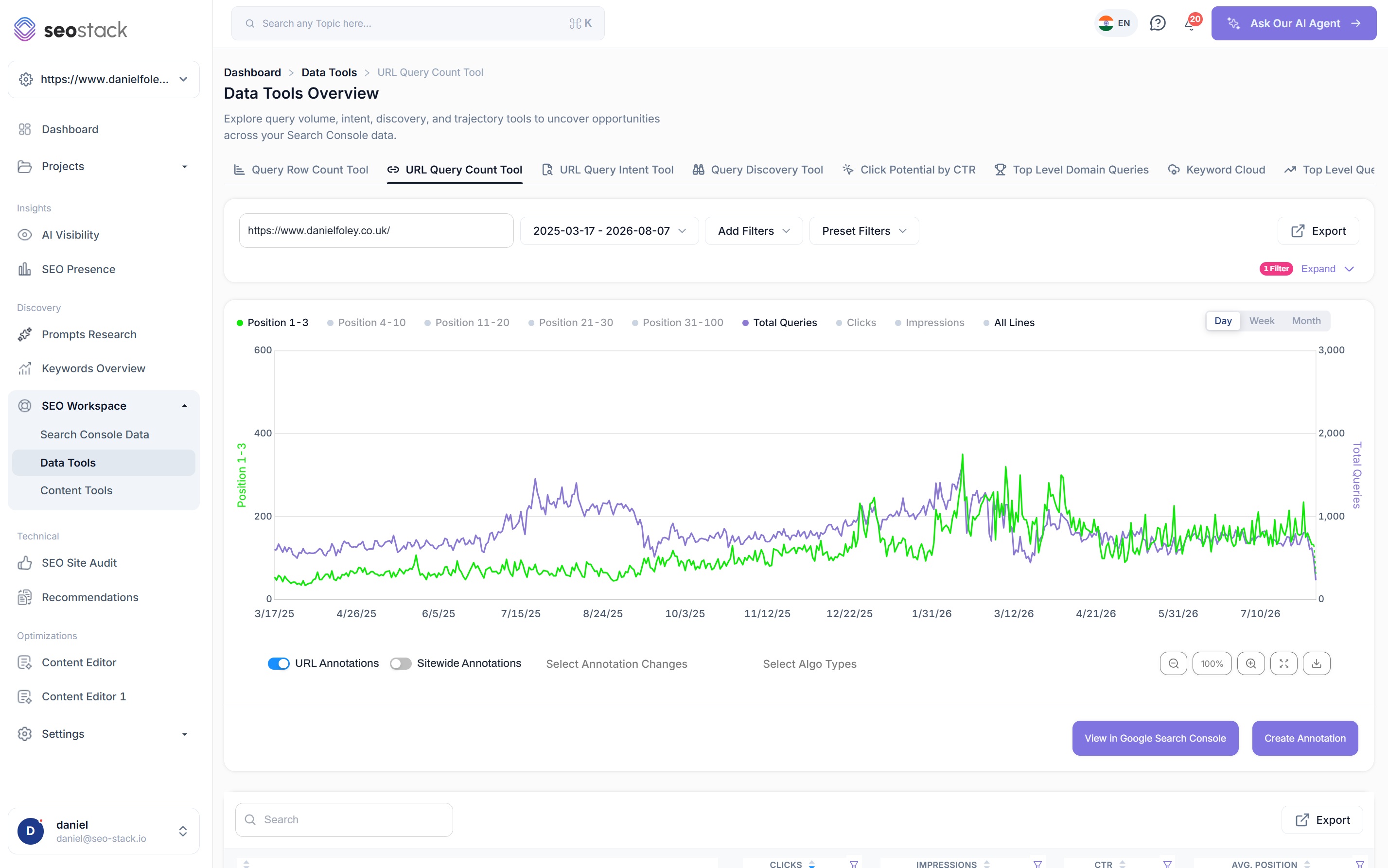
Put any two things side by side and look for the relationship
- Positions 1 to 3 against clicks, to see whether your strongest rankings are actually earning traffic
- Positions 1 to 3 and 4 to 10 against impressions, to see whether the top of the site is expanding
- Total queries against clicks, which is the clearest way to separate reach from ranking
- Hover any point for the exact figures on every line you have enabled
This is where the answer usually is
Positions 1 to 3 climbing steadily while clicks stay flat is a very specific finding, and it points at how the results page is presenting you rather than at your rankings.
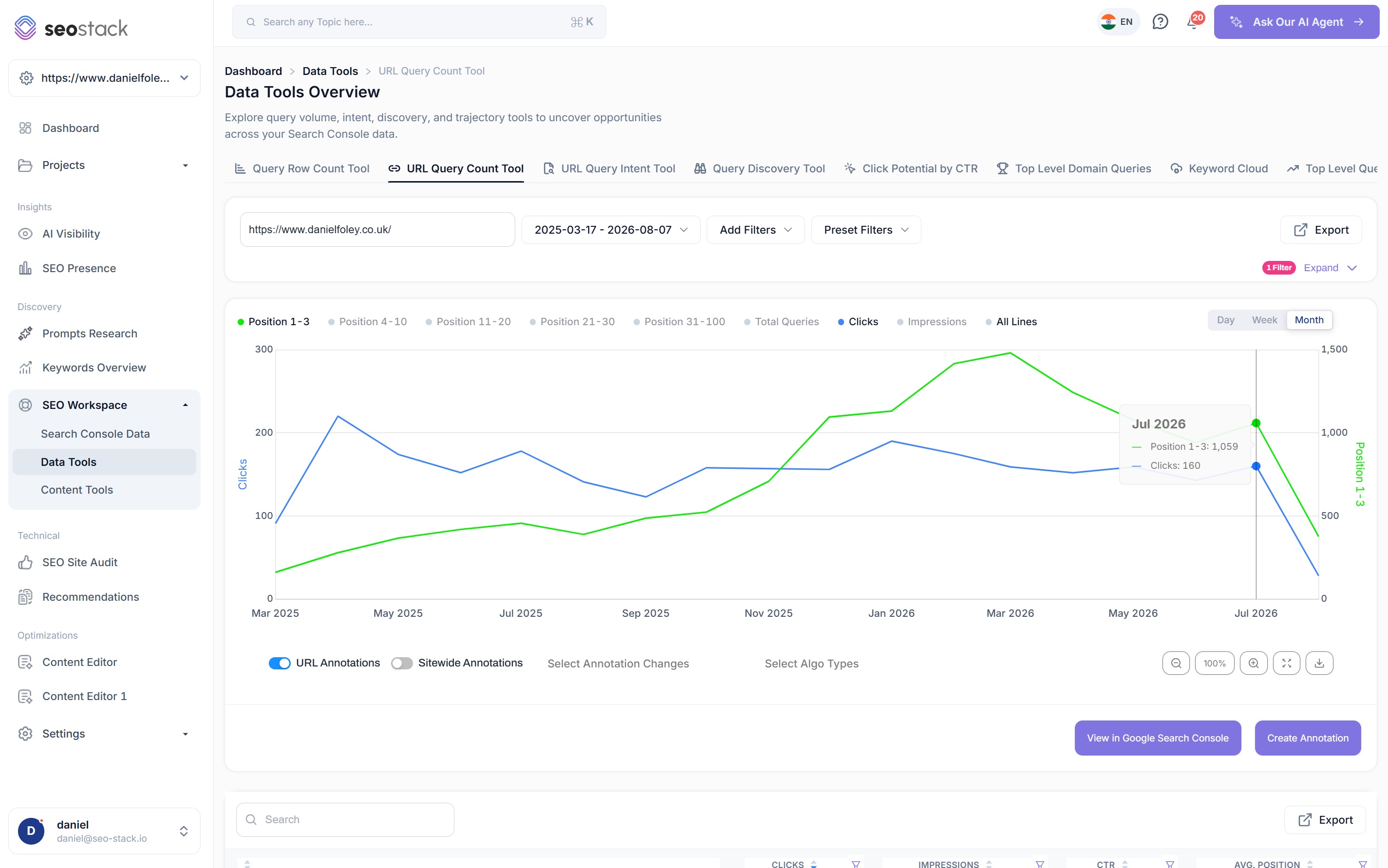
Find pages Google has stopped serving, and check how old they are
- Query count, queries with clicks and zero click queries side by side for every URL
- Age of page index on each row, so you can separate a young URL that has not matured from an old one that has decayed
- HTTP status and index status inline, because a weak count sometimes has a much more boring explanation
- Query count over time available on any row without leaving the report
- A low query count on an old, indexed, 200 page is one of the strongest dead content signals you can get
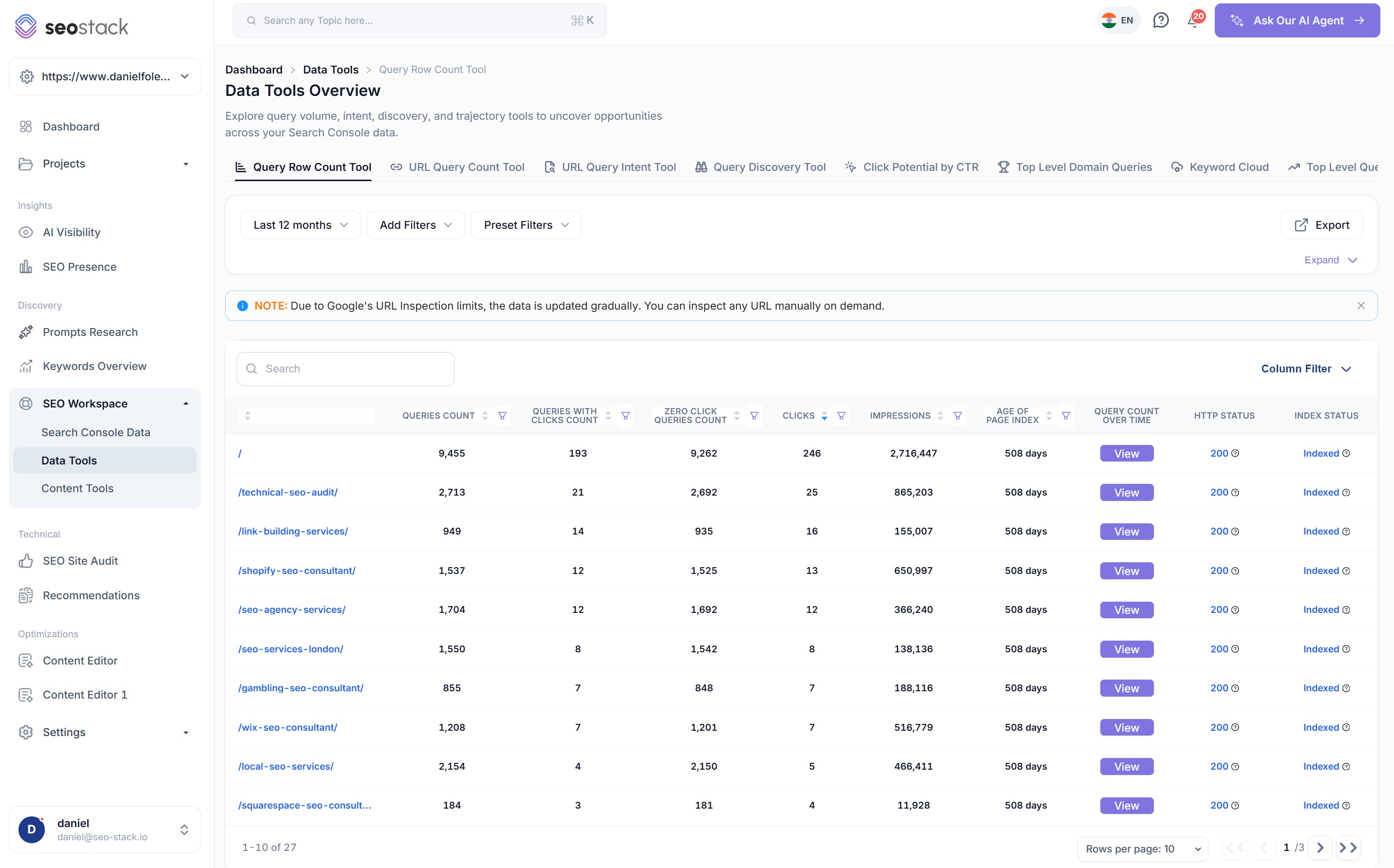
Query volume per position band, month by month
- Every position band as a row, every month as a column, with a change figure between each one
- This is where a slow migration between bands becomes obvious rather than something you have to infer
- The query table above it shows clicks, impressions, CTR and average position for the individual queries
- Export the whole thing when you need to work on it elsewhere
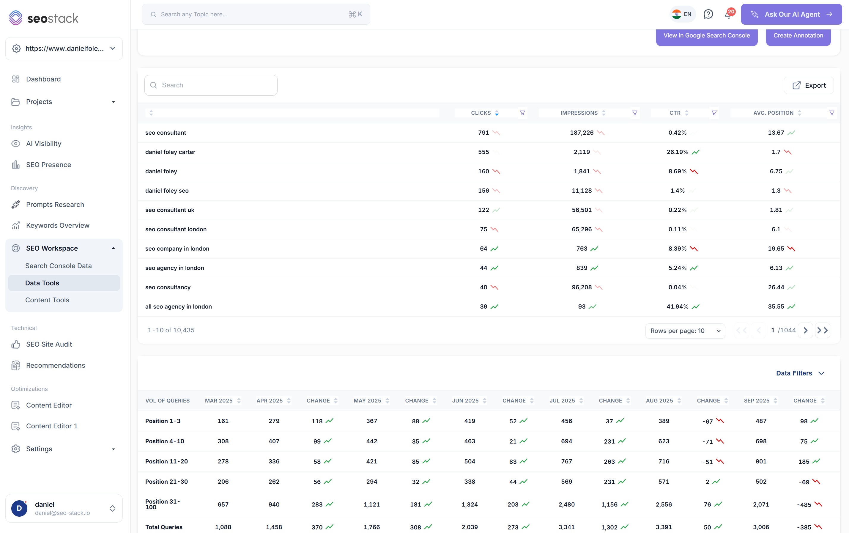
Annotations
Log what you changed, then see what it did
This is where most of the value in query counting sits. You record an annotation for a change you made, whether that is a rewrite, a template change, an internal linking pass or a technical fix, and it is plotted directly onto the query count chart. From that point you are not guessing at whether something worked, you are looking at the total query count and each position band either side of the date you made the change.
- Create an annotation without leaving the chart you are looking at
- URL level annotations and sitewide annotations toggled independently
- Filter to specific annotation changes when a period gets busy
- Google algorithm updates overlaid alongside your own changes, so you can rule them in or out
AI Assistant
Have the assistant audit your annotations against the data
Once you have a few months of annotations logged, the AI Assistant can read them alongside your query counts and tell you which of your changes actually did something, rather than leaving you to eyeball a chart and hope.
Positive impact
Query counts and position bands improved after the change in a way that holds up over the following weeks rather than for a few days.
Neutral impact
Nothing meaningful moved. Worth knowing, because a change that did nothing is a change you do not need to repeat across the rest of the site.
Negative impact
Counts fell after the change. The sooner you know that, the sooner you can roll it back or work out what about it caused the problem.
Over a year of work this turns into something genuinely valuable, a record of which types of change move query counts on your site and which do not, based on your own results rather than on what worked for somebody else.
Why SEOs use it
What query counting is actually good for
Diagnose click loss properly
Separate a position slip from a drop in the number of queries you are served for. One needs better rankings, the other needs the page to be relevant for more again, and getting that wrong costs you months.
Spot devaluation early
A falling total query count while positions hold is one of the earliest signals that Google is narrowing what it considers your page relevant for, and it shows up long before clicks make it obvious.
Identify dead content
URLs with very low query counts, high zero click counts and a page index age measured in years are the clearest candidates for consolidating, rewriting or removing.
Judge young pages fairly
Because you can see the age of the page index, you can avoid writing off a URL that simply has not had time to mature, which is one of the most common mistakes in content pruning.
Read trajectory, not snapshots
The line chart is the fastest way to get a feel for whether a page or a section is genuinely growing, because a single month tells you very little and a year of query counts tells you a great deal.
Prove impact to clients
Being able to point at an annotation and show the query count moving afterwards is a far stronger argument than a traffic chart that anyone could attribute to seasonality.
What you get out of it
The outcome, not the feature list
Tell the difference between a ranking slip and Google devaluing the page
Prove a specific change caused a specific movement rather than assuming it
Find weak URLs that are old enough to know better, and leave the young ones alone
Connect a property. Watch the data start stacking.
Warehousing begins the moment you connect your Search Console property, there is no Google Cloud project to set up, no BigQuery and no schema to design. You simply connect your property and SEO Stack starts storing every row of your data from that day onwards.
- Credit card required
- Cancel within the trial and you won't be billed
- No contracts