A Guide to Using Google Search Console Performance Tools

Daniel has 25+ years SEO experience & loves everything SEO including testing, ranking & getting clients results
The Performance report is the most important part of Google Search Console. It is where the real data of how your site actually performs in Google Search gets told not in rankings, not in third-party estimates, but in the clicks, impressions and queries Google itself recorded.
This guide walks through every part of the Performance report in detail: what each metric means, how the filters behave (including their limits and quirks), how the date picker and comparison view work, how to use regex properly, what you can and cannot export, and crucially the anonymisation rules that explain why the numbers in the chart never quite match the sum of the numbers in the table.
Watch this video on using Google Search Console performance tools:
What the Performance report actually is
The Performance report shows you how your verified property performed in Google Search results over time. Every row in the table and every point on the chart reflects a real search event Google logged: someone issued a query, one of your URLs appeared on a results page, and it either received a click or didn't.
There are three separate Performance reports sitting under one menu:
Search results the main one, covering organic results across Web, Image, Video and News search.
Discover only appears if your site has received Discover traffic.
Google News only appears if your site is eligible for and has received traffic from the Google News app and news.google.com.
This guide focuses on the Search results report, which is where most SEO decisions are made.
The four core metrics
Everything in the Performance report is built on four numbers.
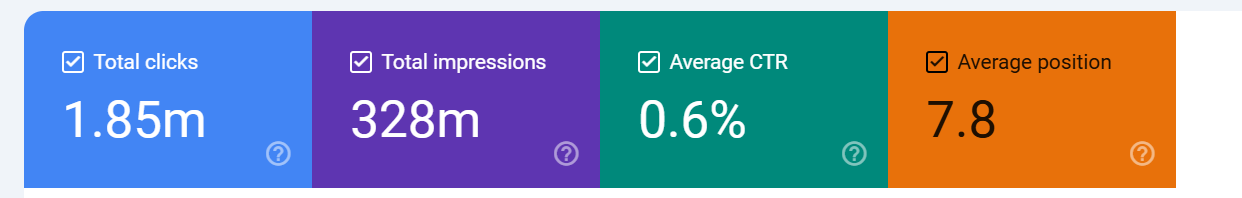
Clicks the number of times a user clicked through from a Google search result to your site. If the user clicked back and clicked again, that's still one click for most scenarios (Google deduplicates certain behaviours). Clicks on paid results are not counted here.
There are 2 types of click (anonymised and non anonymised) - basically, some clicks
carry data and some do not.
Impressions the number of times a URL of yours appeared in search results that a user viewed. Importantly, an impression is only counted when the result is actually rendered on screen, for results below the fold, Google counts the impression only if the user scrolls and the result comes into view. So if for example, you were on page 1 at position 10,
if 100 people searched but only 10 people scrolled to the point where your result showed you would get 10 impressions.
CTR (click-through rate) clicks divided by impressions, expressed as a percentage. It is calculated, not reported. This matters, because the "position" metric feeds into how you should interpret CTR an 3% CTR at position 2 is poor, but the same 3% at position 9 is much better.
Average position the average top position of your site for the query or page in question across all impressions in the selected date range. If your page appeared at positions 3, 5 and 7 across three impressions, the average position is 5. This is a weighted average across every impression in the period, which creates some nuance we'll come back to later.
The date picker and the 16-month limit
By default, the report loads the last three months of data. The date picker in the top-left of the report lets you widen or narrow that window using preset ranges (7 days, 28 days, 3 months, 6 months, 12 months, 16 months) or a custom date range.
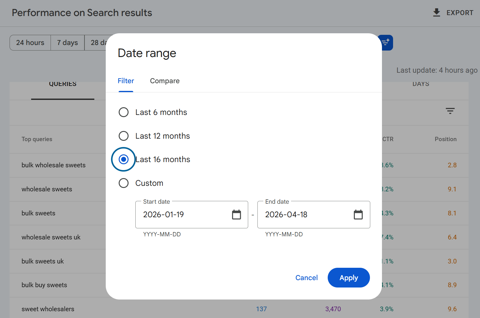
The absolute maximum is 16 months of rolling data. You cannot pull data older than that through the UI.
The 16-month window exists because Google set this as a sufficient look-back timeframe for data, adequate in the sense that most webmasters really don't need more data than this. It's a deliberate compromise between storage cost, query performance and practical usefulness. If you need to preserve history beyond 16 months, you need to either export data regularly or set up the Bulk Data Export to BigQuery, which retains data indefinitely once you've turned it on.
OR you can use our SEO Stack platform to back up and store your google search console data with storage of 10+ years available WHILST maintaining a consistent user experience and user interface.
One other thing about the date picker: data is typically available up to around 1-2 days ago, sometimes a little less. If today's date is showing gaps or missing numbers, that's usually a processing lag rather than a real drop.
You can see when data was last updated by looking at the right hand side of performance tool section under the export button, it will say when the data was last updated.
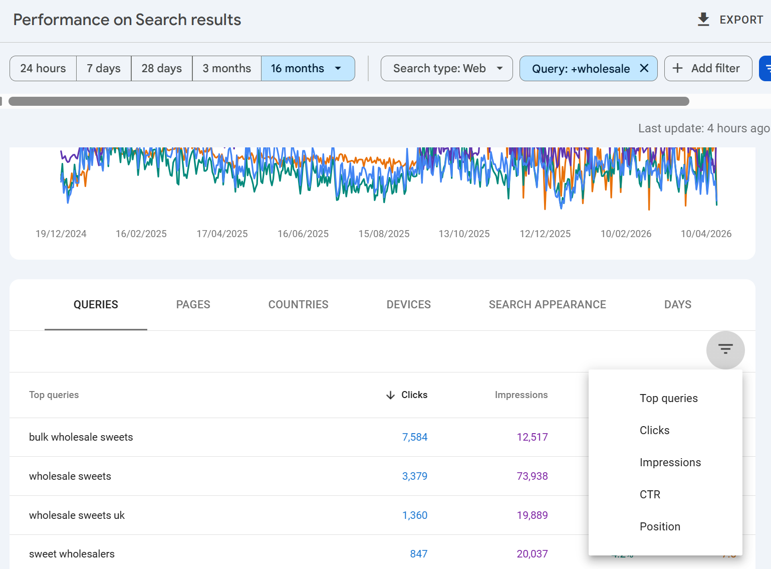
The date comparison tool
Inside the date picker, switch to the Compare tab to put two periods side by side. You can compare the last 7/28/90 days or you can compare time-frames year over year.
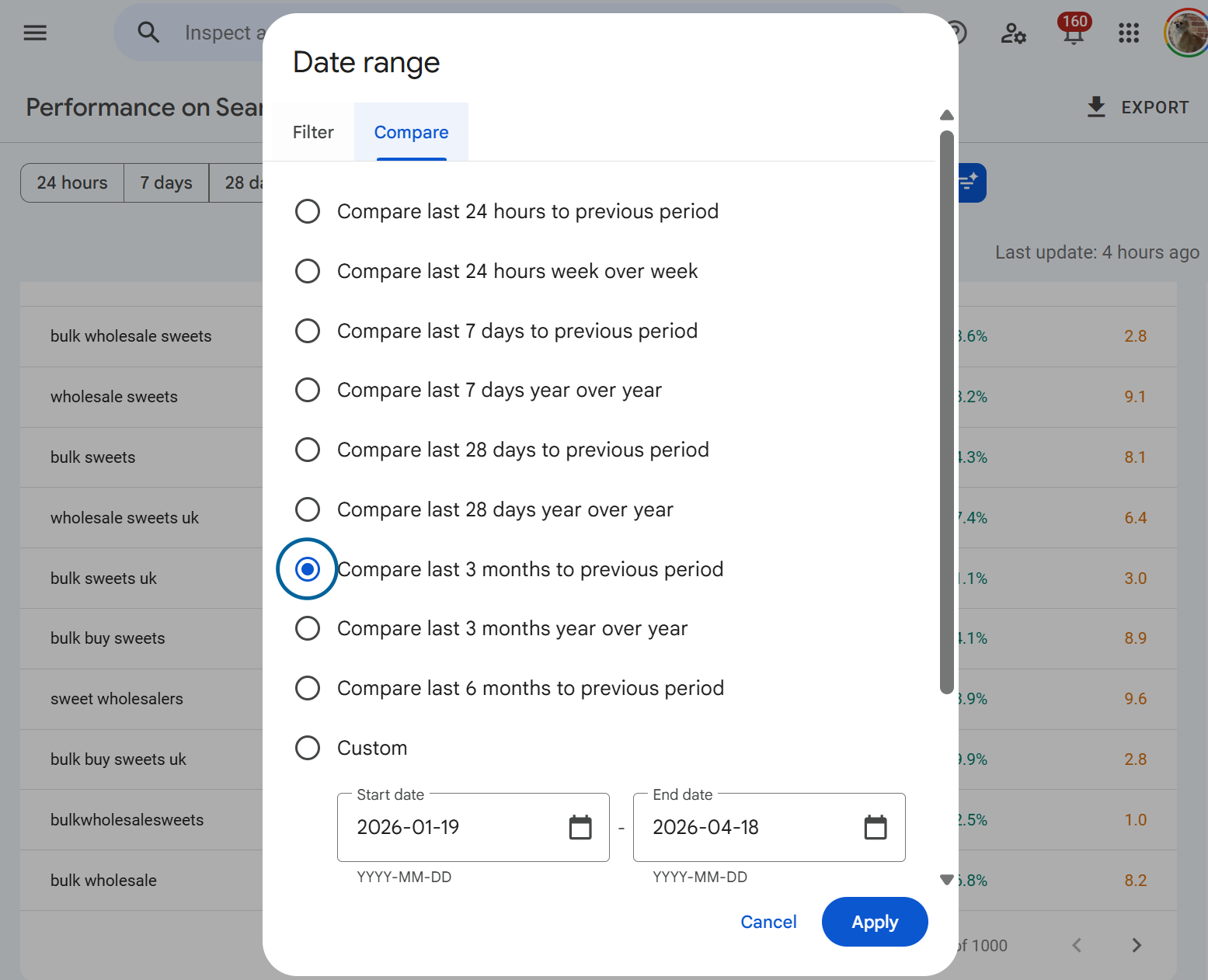
When comparison is active, the chart overlays the two periods with a dotted line for the comparison period, and the table adds delta columns showing the absolute and percentage change for each metric. This is where year-on-year analysis happens, and it's by far the fastest way to spot which queries, pages or countries have gained or lost ground since the previous period.
Above - we see the comparison of the time-period selected, we can use this to compare performance over time.
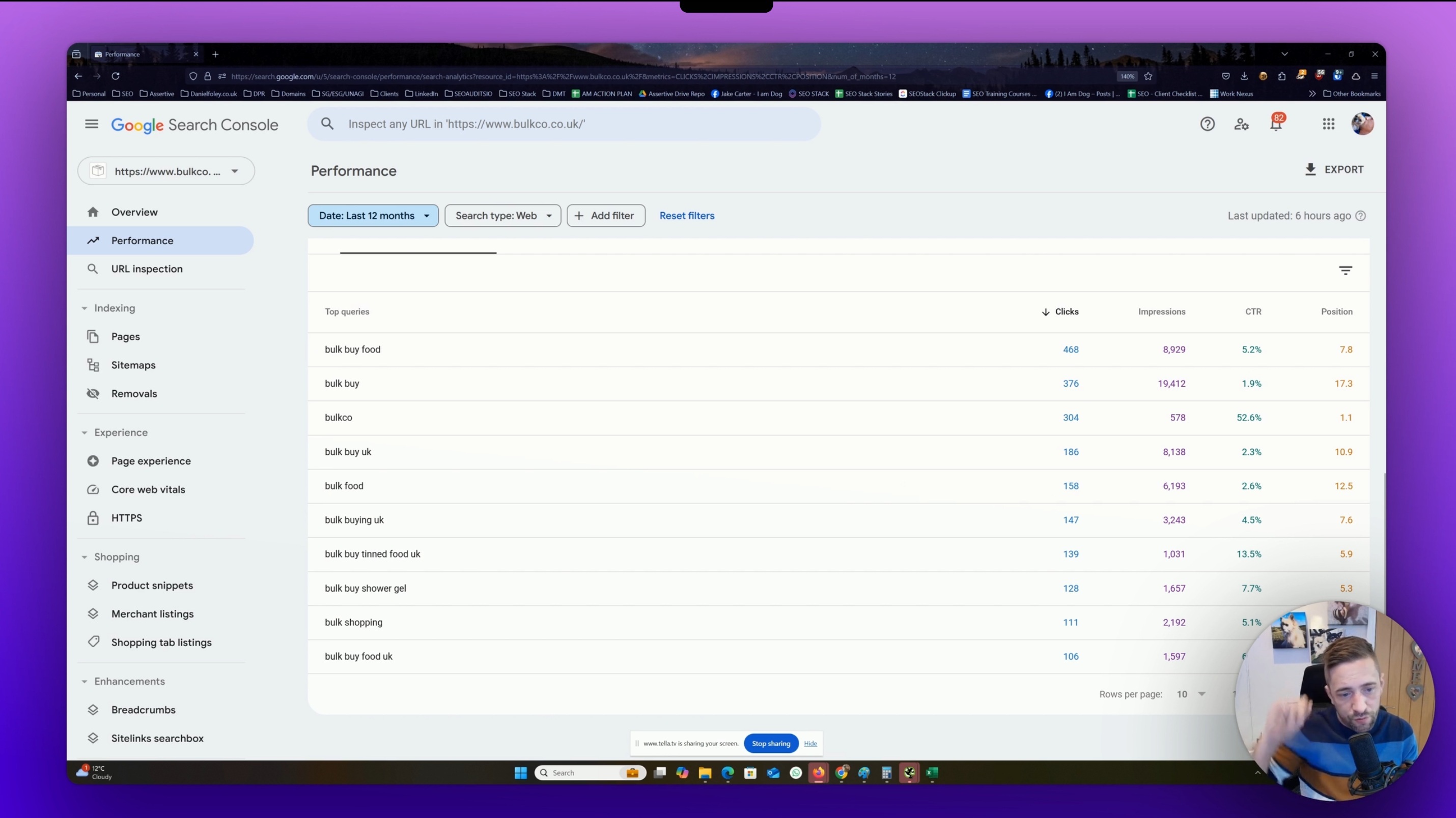
If you scroll down and look at the pages or queries tab:
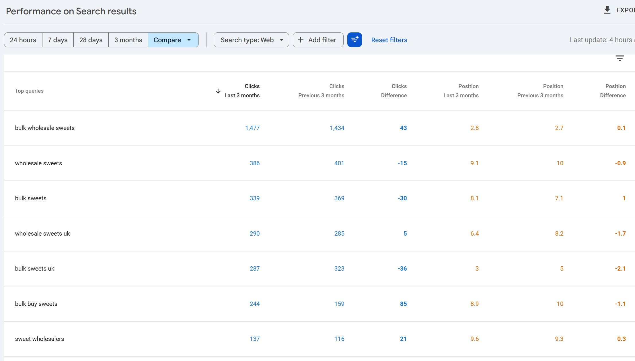
You'll be able to see which queries/pages lost or gained clicks, impressions, CTR or position.
A few practical notes. Comparing the last 28 days against the previous 28 days gives you a clean, seasonality-adjusted view because the weekday/weekend pattern aligns. Comparing last 28 days to the same 28 days a year ago gives you year-on-year but misaligns weekdays. For most reporting, year-on-year using the same calendar window is the right call even with the weekday skew.
Search types
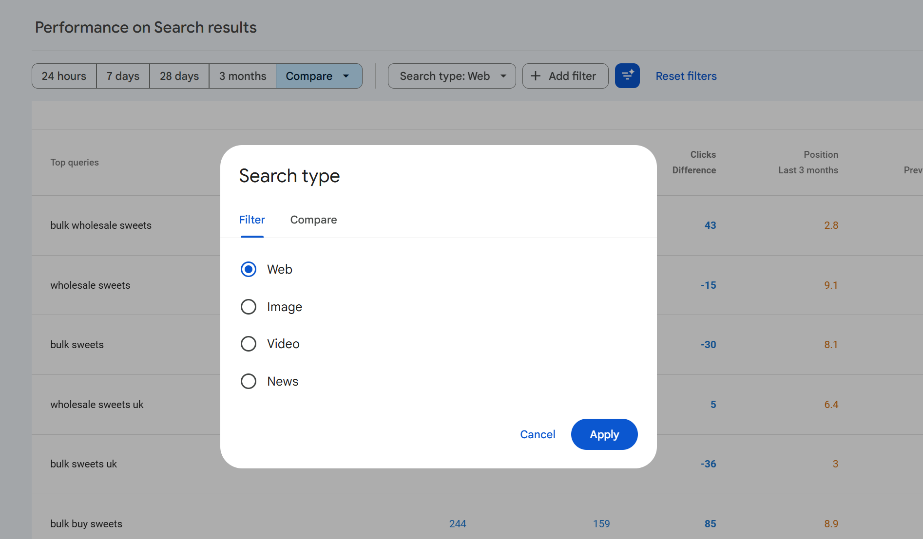
Along the top of the report sits a filter called Search type. By default this is set to Web, but you can change it to any of:
Web standard organic results on google.com and country equivalents.
Image results from Google Images.
Video results where a video thumbnail was the clicked result.
News results from the News tab of Google Search (distinct from the standalone Google News report).
Each search type has its own set of clicks, impressions, CTR and position. A single page can accumulate impressions across all four types simultaneously, and the totals do not add up to a single cross-type total in the default view. Web is shown in isolation unless you change it.
Comparing search types
Click on the Search type filter and switch to the Compare tab to put two search types head-to-head. The most useful comparisons are usually Web vs Image, because the behaviour on those two surfaces is completely different Image typically generates very high impression counts with very low CTRs, and Image traffic is often underestimated because people don't look at it by default.
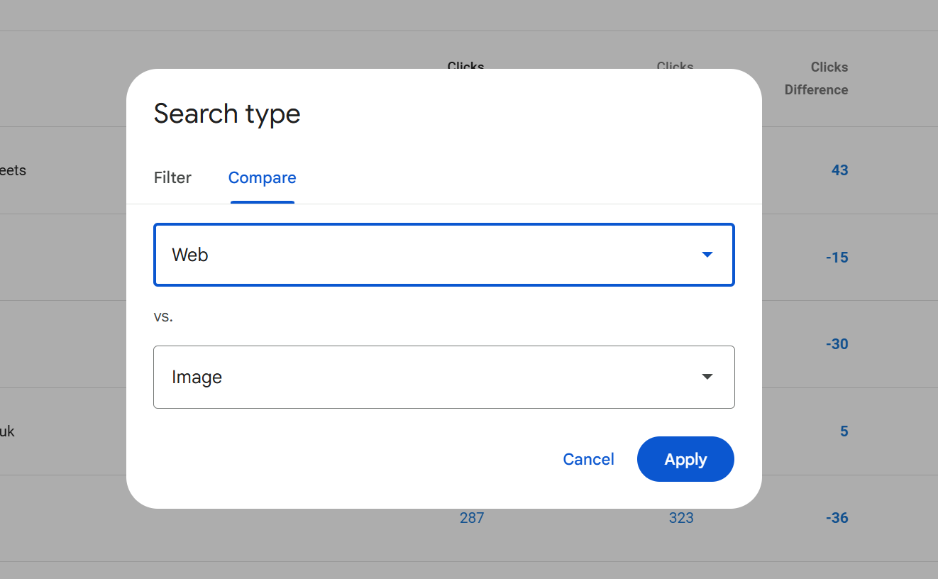
Comparison works the same way as date comparison: the chart overlays both types and the table shows each metric twice, one column per search type.
Filters: queries, pages, countries, devices, search appearance, dates
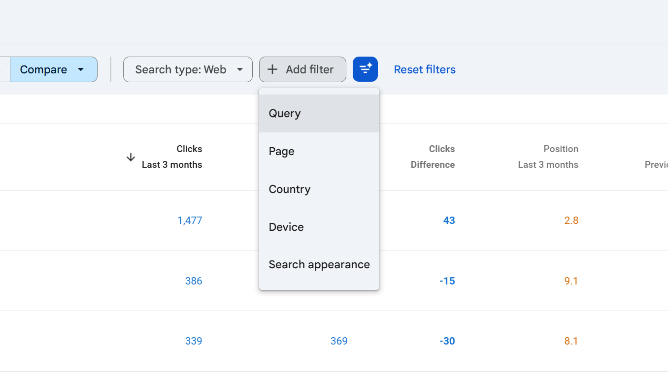
Above the chart sits a row of filter chips. Each one narrows the report to a subset of the data:
Query filter to impressions for specific search queries.
Page filter to a specific URL or URL pattern.
Country filter by the country the user was searching from.
Device desktop, mobile or tablet.
Search appearance results that triggered specific SERP features (AMP, Web Stories, Videos, Product snippets, Review snippets, Sitelinks, Translated results and others, depending on what your site qualifies for).
Date the same picker as above, exposed as a chip once you've made a change.
You can stack filters. A filter combination like Country = United Kingdom, Device = Mobile, Query contains "seo audit" will narrow the whole report chart and table to just those impressions.
Using the filters
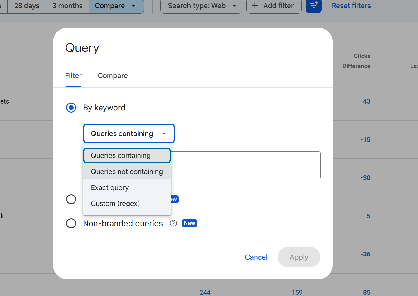
Each filter opens a small dialog with a type-in field and three matching modes for string filters (Query and Page):
Contains the field contains the string anywhere in it.
Does not contain the field does not contain the string.
Exactly matches the field equals the string exactly.
Does not exactly match the field is anything other than that string.
Custom (regex) matches a regular expression (see the regex section below).
Doesn't match regex the inverse.
Country, device and search appearance filters are selected from fixed lists rather than free text, because the values are controlled.
A filter is sticky once applied: it stays on until you remove it by clicking the cross on the chip. It is very easy to leave a filter active, switch to another tab or come back later, and interpret the numbers as if they were unfiltered. Always glance at the chip row before reading the numbers.
Filter limitations
The Performance report has some hard limits that catch SEOs out, this is one of the reasons why we built SEO stack, because the filtering limitations are real, they're a pain and they make it hard to get more from your data.
Only one filter per dimension at a time. You can filter by Query contains "seo", or Query does not contain "free", but you cannot have two Query filters active at once unless you combine them into a single regex.
No OR logic in the basic matching modes. "Contains A" and "Contains B" as two filters is not possible. The workaround is regex:
seo audit|technical audit|site auditgets you the OR behaviour.String matches are case-insensitive for Contains and Exactly matches, but regex is case-sensitive by default (more on that below).
Filter values are trimmed and normalised leading/trailing spaces are stripped, and URLs need to match the exact protocol and subdomain of how they appear in the data.
You cannot filter by CTR, clicks, impressions or position. These are metrics, not dimensions. To see only queries with more than X clicks, export the table and filter in a spreadsheet.
Regex filters: syntax and examples
Regex is the most powerful filtering option in GSC and the one most SEOs underuse. It uses Google's RE2 regex syntax, which is a restricted form of PCRE safe, fast, and deliberately lacks features like lookbehinds that can cause performance issues.
We wrote a comprehensive article called "Google Search Console & Regex Filters: The Ultimate Guide" take a read of it as it will show you all the different regex examples and use cases.
Key rules to know:
Regex in GSC is case-sensitive by default. To make it case-insensitive, prefix with
(?i). For example(?i)seomatches SEO, Seo, seo, sEo, etc.Your regex must match anywhere in the string unless you anchor it with
^(start) or$(end).The maximum regex length is 4,096 characters.
Practical examples:
Goal | Regex |
|---|---|
Match branded queries |
|
Question queries (how/what/why/when) | `(?i)^(how |
Queries containing any of several terms | `(?i)(audit |
URLs in a specific directory |
|
Exclude branded terms (with the "doesn't match regex" option) | `(?i)(assertive ?media |
Long-tail queries (5+ words) |
|
Numeric queries (contain a number) |
|
Local queries containing city names | `(?i)(london |
One thing worth noting: regex in the Query filter tests the query text; regex in the Page filter tests the full URL including protocol and hostname. So ^/blog/ won't work on a Page filter you need ^https://example\.com/blog/ (with the literal dot escaped).
Exporting data
The export button in the top right exports the current view meaning the current filters, date range, search type and selected tab all apply.
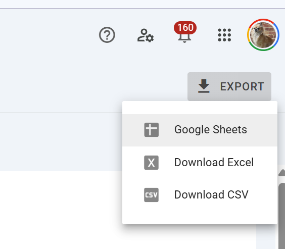
Formats available:
CSV (downloaded as a ZIP containing one CSV per table tab).
Excel (.xlsx, with each tab as a separate sheet).
Google Sheets (opens directly in Drive).
The row limit is the big caveat. The standard GSC UI export caps each table at 1,000 rows. So if you export the Queries tab, you get the top 1,000 queries by clicks (or whichever column you've sorted by), not every query.
If you need more than 1,000 rows, you have three options:
Filter first, export second. Apply a filter that narrows the data (by country, device, URL path, regex on queries), then export. By slicing the dataset into smaller segments, you can effectively get more than 1,000 rows in total across multiple exports.
Use the Search Console API. The API returns up to 25,000 rows per request, and you can paginate.
Set up the Bulk Data Export to BigQuery. This is Google's official long-term pipeline all your Search Console data streams into BigQuery daily, with no row limit, and you can query it with SQL.
Use SEO Stack, sign up for a FREE account here and use the coupon: KHDUAGPQ for a 30 day free trial and access ALL of your search console data without the limitation
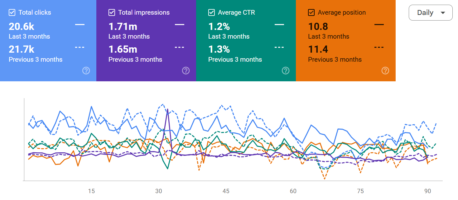
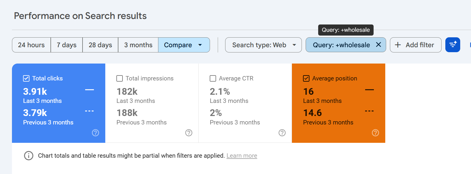
The chart and its metrics
The chart above the table plots whichever metrics you've toggled on clicks, impressions, average CTR, average position on a time series. Each metric has its own Y-axis when more than one is active, and each metric has its own colour-coded card above the chart that acts as both a total and a toggle.
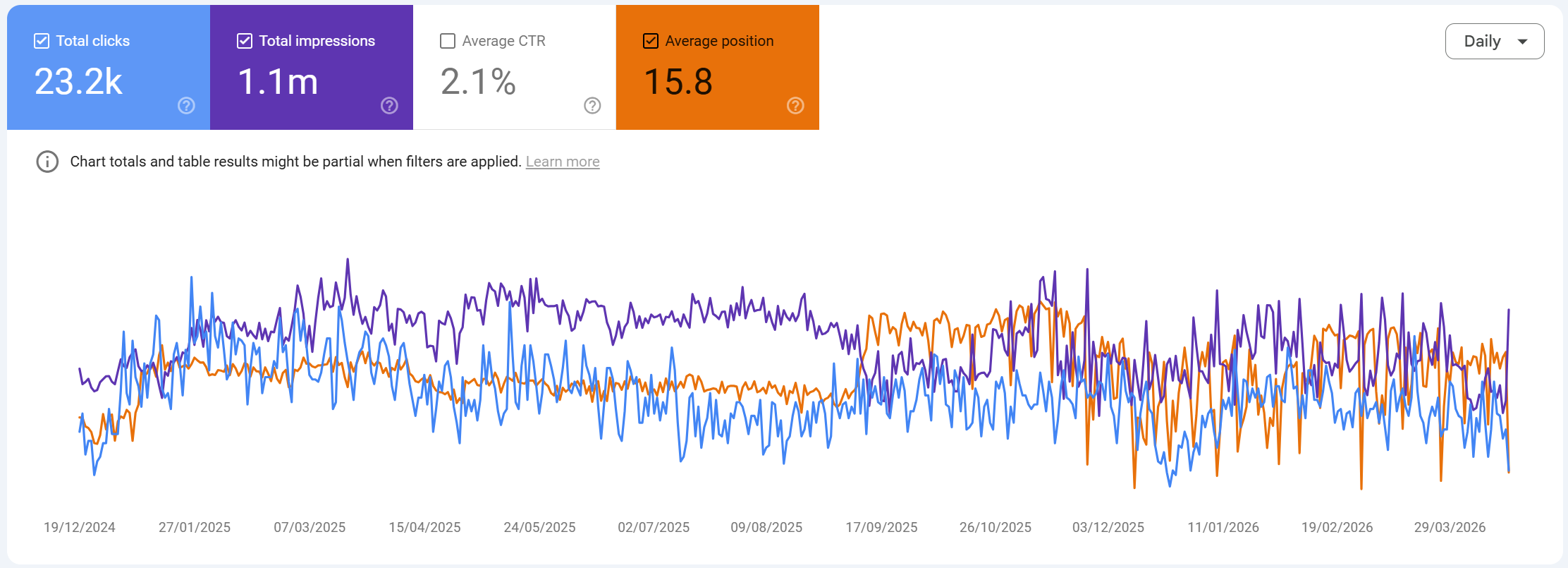
A few things to know about the chart:
The chart reflects the total for the date range, summed across whichever filters are applied. So if you filter by
Query contains "seo"and your date range is 3 months, the chart shows clicks and impressions for those matching queries over those 3 months.Average position on the chart is inverted conceptually a lower number is better. Google plots it so that upward movement on the chart can feel counterintuitive. Mentally read it as "rank 1 at the top."
CTR is an average, not a sum. When the chart shows a CTR line, it's showing the CTR each day calculated from that day's clicks divided by that day's impressions, not a rolling average of prior days.
Totals at the top of each metric card are the period totals, not daily averages. Clicks and impressions are summed; CTR and position are weighted averages across the period.
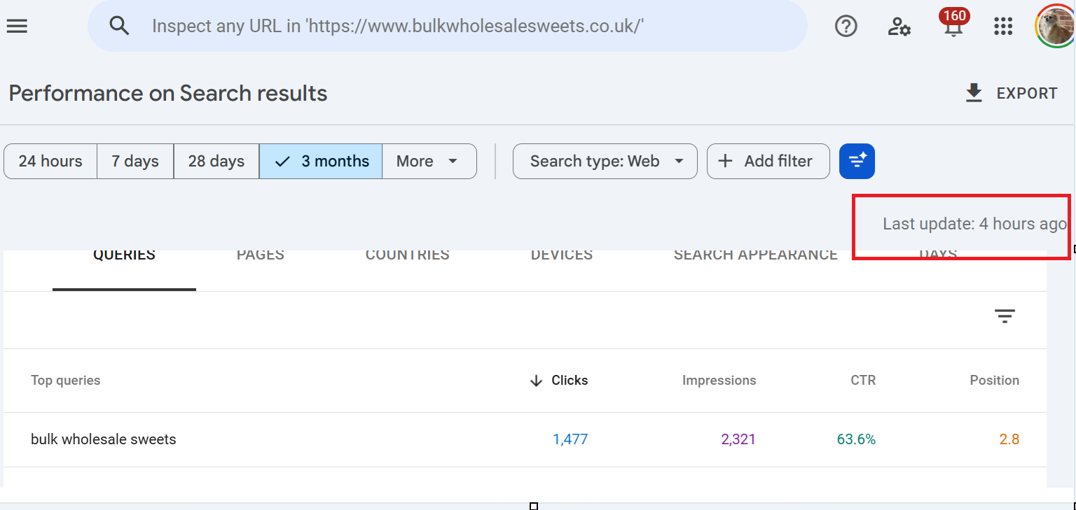
The Queries tab with all the nuances
The first tab under the chart is Queries, and it's where most SEO analysis starts. Each row is one search query, with four columns: clicks, impressions, CTR and position.
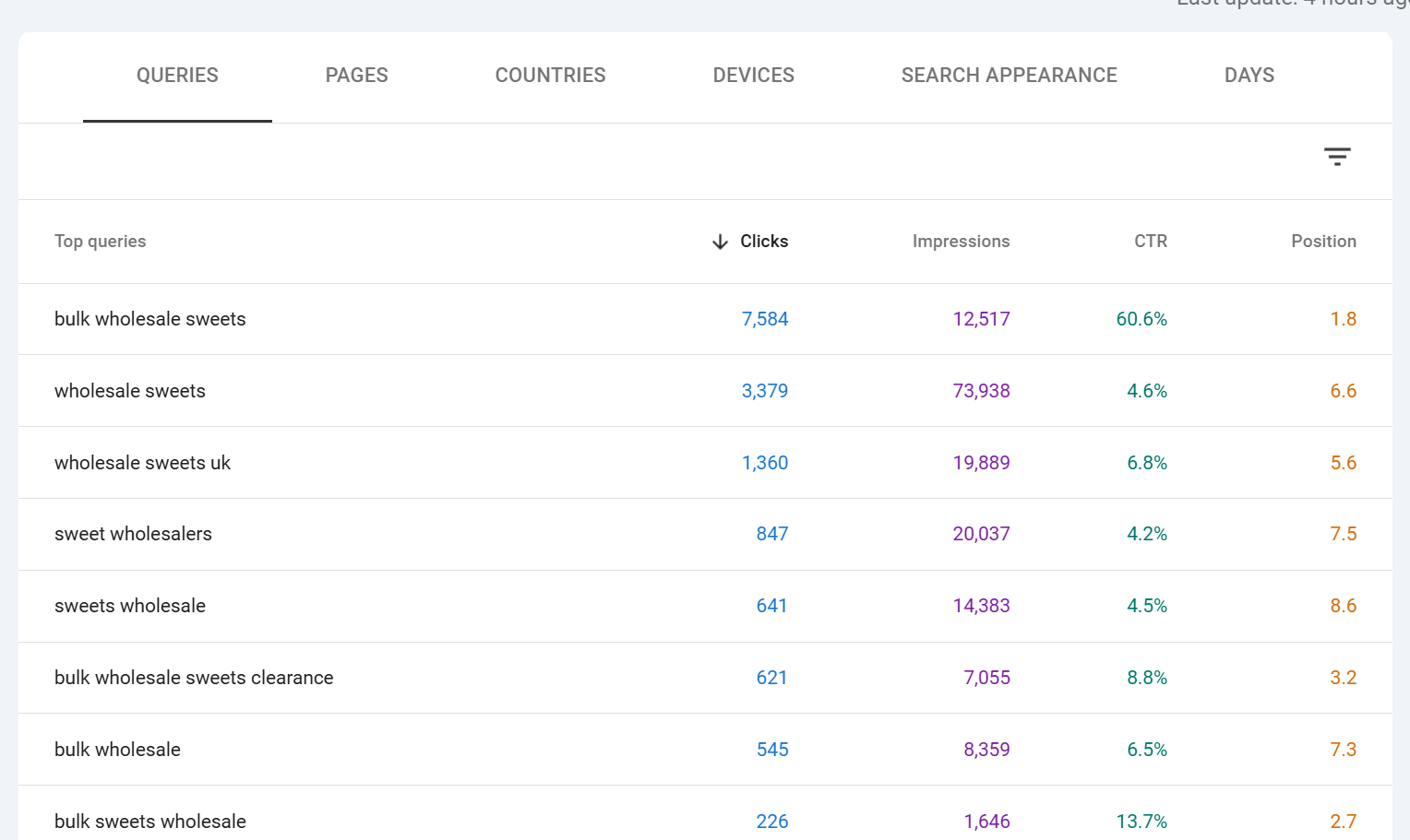
Here is where the subtleties matter.
Clicks on this tab is the number of times any URL of yours was clicked for that specific query over the selected period. If someone searched "seo audit tool" and clicked your page, then came back the next day and searched the same thing and clicked again, that's two clicks on that query row.
Impressions is the number of times any URL of yours appeared on the results page for that query. A single search that showed two of your URLs counts as two impressions for that query. This is why CTR calculations on query rows can look odd if you have multiple ranking URLs.
CTR is clicks divided by impressions for that query. Because impressions are counted per URL shown, a query where you have two URLs ranking will inflate impressions (and therefore deflate CTR) compared to a query where you only have one URL in the results.
Position is the weighted average top position of your highest-ranking URL for that query, across all impressions in the date range. Three nuances really matter here:
It is an average. If your page was at position 4 for 80% of the period and position 12 for 20%, your reported position will be around 5.6. It is not "the position you rank right now."
It is weighted by impressions, not by time. A day with 10,000 impressions at position 3 counts 10x more towards the average than a day with 1,000 impressions at position 7.
It reports the top position of your best-ranking URL in each impression, not every URL. If you had pages at positions 3 and 8 in the same SERP, Google records position 3 for that impression.
Position is only recorded when the result was actually displayed to the user, meaning it reflects what users saw, not all possible SERP positions for that query.
The practical takeaway: treat position as a trend indicator, not a live rank tracker. If you need live positions, use a dedicated rank tracker. If you want to know whether you are trending up or down, GSC position averaged over 28 days is one of the most reliable signals you can get.
The Pages tab
The Pages tab is identical in structure to Queries, but each row is one URL of yours. Clicks, impressions, CTR and position now describe how that specific URL performed across all queries it appeared for.
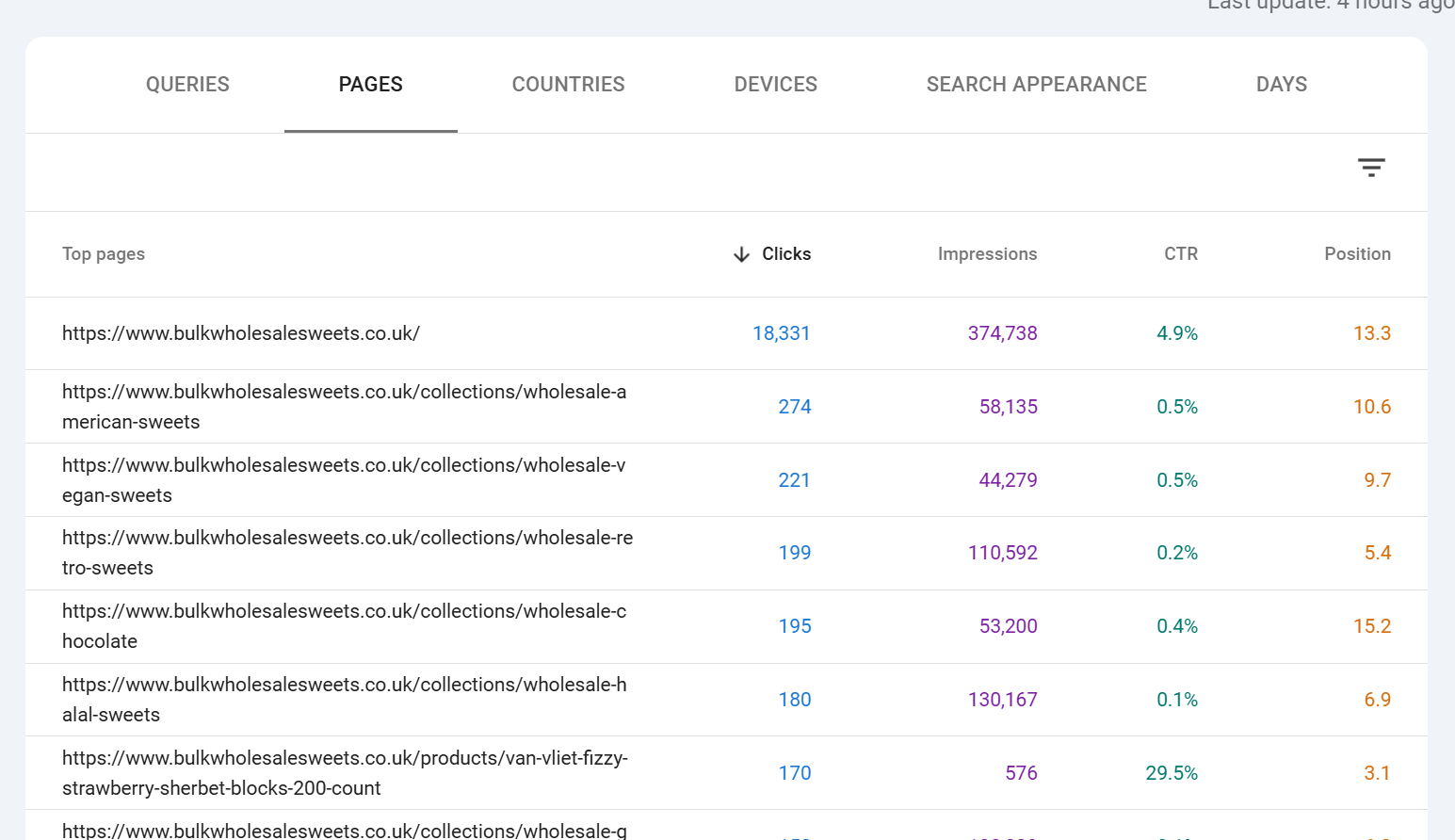
Position on the Pages tab is the weighted average position of that page across all queries it ranked for. A page that ranks #1 for one rare query and #20 for a thousand common queries will have a position closer to 20, not 1. This is why high-value pages can appear to have mediocre positions they're ranking well for their target queries but picking up a long tail of weaker rankings that pull the average down.
The Pages tab is also where you'll spot two important things: pages getting impressions but no clicks (a targeting or SERP-appearance problem) and pages getting clicks that you didn't expect to rank (opportunities to optimise for queries you weren't targeting).
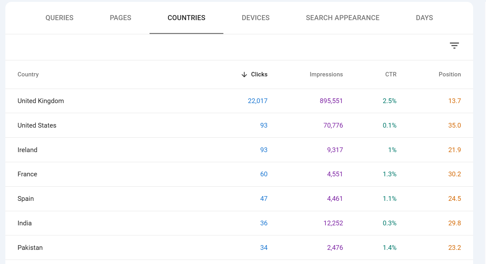
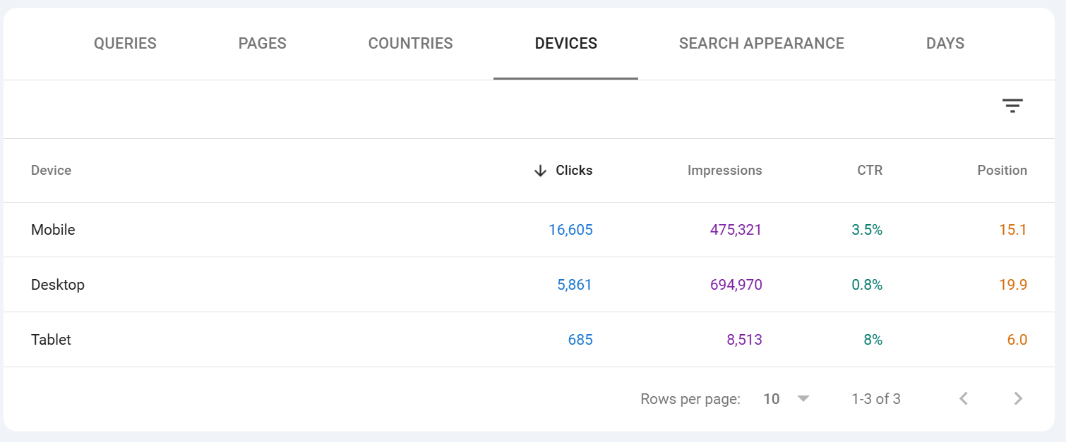
Countries, Devices, Dates and Search Appearance tabs
Countries shows clicks, impressions, CTR and position broken down by the country the user searched from. This is essential for international sites and very useful even for single-country sites, because you'll often find meaningful traffic from countries you didn't know were interested.
Devices splits the data across Desktop, Mobile and Tablet. Tablet is very small on most sites now. Mobile is typically 60-75% of traffic for most verticals, but the CTR and conversion behaviour across devices can differ sharply always look at both.
Dates is a straightforward day-by-day breakdown of the four metrics. It is the tabular equivalent of the chart, and it's the easiest way to spot anomalies one day with unusually high or low numbers is often a data glitch, an algorithm update, or something worth investigating. This is no longer in search console as dates but rather "DAYS".
Search Appearance is the most often overlooked tab. It only shows rows for SERP features your site has actually triggered: AMP, Videos, Web Stories, Product snippets, Review snippets, Sitelinks, FAQ results (where still supported), Translated results, and so on. This tab is how you measure whether your structured data is actually paying off if you've implemented Product markup and the Product snippet row shows zero impressions, something is wrong with your markup or eligibility.
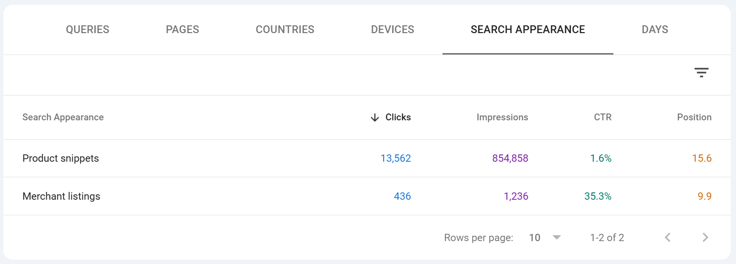
Table filtering options
Every tab has its own local sort and filter. Click any column header to sort ascending or descending. Click the small filter icon (or type into the search box above the table, depending on your UI version) to narrow the table to rows matching a string.
Two important behaviours to be aware of:
Table search applies on top of the main filters. So if you already have a page filter applied above the chart, searching for a query in the table narrows further within that filter.
Table search is not regex. For regex matching, use the main Query or Page filter chip above the chart, not the table search.
Sorting by a metric sorts the visible rows only, up to the 1,000-row cap. If you sort by position ascending, you're seeing the best positions among the top 1,000 rows by clicks (the default sort), not the best positions across every query you have.
Anonymised data and why the chart and table don't match
This is the single most misunderstood thing about the Performance report, and it's responsible for almost every "why don't these numbers add up" question in SEO forums. We wrote a post about this as its a real issue, especially for SEOs who are learning and may not understand why the data doesn;'t always add up, check out the article it's called "Why is data missing from Google Search Console" and its about this in more detail - it runs through anonymised vs non anonymised data, why it happens etc.
Google anonymises rare queries. If a query has been issued by only a handful of users over a given period typically queries that could identify an individual or contain personal information Google does not show that query in the Queries table. The row is suppressed entirely, not aggregated into an "other" row.
However, the clicks and impressions from those anonymised queries are still counted in the chart totals and in the Pages, Countries, Devices and Dates tabs. They're only hidden from the Queries tab specifically.
This is why:
The sum of clicks across all rows in the Queries tab is almost always lower than the total clicks shown at the top of the chart.
The same is true for impressions.
The gap between the two is your anonymised query volume.
The gap varies enormously by site — sites with lots of long-tail branded or personal queries see huge gaps (30%+ is not unusual), sites with predominantly commercial head-term traffic see smaller gaps.
Anonymised queries also affect position. Because the position shown on each query row is the average across impressions for that query, and anonymised queries are excluded from the Queries tab entirely, the "average position" you compute by averaging query rows will not match the aggregate position shown on the chart.
There are a few other sources of minor discrepancy:
Late data. Data within the last 48 hours can update retroactively as Google finishes processing.
Canonical vs URL reporting. By default GSC reports against canonical URLs, but you can switch the Pages tab to "URL reported" to see the actual URL that appeared. Totals between the two views may differ.
Deduplication rules. Certain rapid repeat clicks and impressions are deduplicated; the exact thresholds aren't published.
The practical rule: trust the chart totals as the accurate total for the period, and treat the Queries table as the "visible" subset of queries that met Google's privacy threshold. When reporting to clients or making decisions, cite chart totals; when doing query-level optimisation work, understand that you're seeing roughly the head and torso of the distribution, not the full long tail.
Wrapping up
The Performance report rewards the time you put into learning its quirks. Once you internalise that:
the chart total is the ground truth,
the table is the visible subset,
position is a weighted average (not a live rank),
regex unlocks filter combinations the default UI won't do,
and the 1,000-row UI limit pushes anything serious toward the API or BigQuery,
you'll read the report faster, catch issues earlier, and make decisions on genuinely accurate data rather than the default view.
Everything else in Search Console Indexing, Core Web Vitals, Enhancements, Links, Manual Actions is diagnostic. The Performance report is where you find out whether any of that work is actually showing up in results.
Ready to transform your SEO?
Join thousands of SEO professionals using SEO Stack to get better results.
Start Free 30 Day Trial